Chocolate City Skate Club
Creating the perfect logo through collaboration.Project Overview
In the thick of COVID-19, like many of us Alex, the founder of Chocolate City Skate Club, found herself locked indoors like many of us. Already a cereal hobbyist, Alex took up rollerskating, which quickly turned from a pastime to a powerful personal avenue to joy.
Emerging from the lockdown, Alex started to skate anywhere and everywhere she could. This quickly led to the creation of a small, tight-knit community of skaters. As things got bigger and more official, she felt inspired to give this not-so-little organization a name and a face, settling naturally on Chocolate City Skate Club (CCSC) encompassing a community of skaters – experienced, brand new, and everything in between.
This is where Alex reached out to me to create a logo for her. An avid creative herself, Alex already had a super clear vision for this logo. She wanted colorful, retro vibes. She wanted a logo that stood out and screamed joy, inclusion, and above all else – skate! We met to discuss the goals and scope of the project, decided on a timeframe & got to work immediately.
1. Finding the Perfect Font
When designing a logo based firmly around an organization’s name, I like nailing down the font first.
After sorting through a couple different options, I presented three finalists: Lovelo, Brasika, & Genty. I felt they all gave off retro, playful vibes while remaining legible and professional.
Brasika, (pictured second) is the font that spoke most to Alex, so we moved forward with that one.


2. Choosing a Color Palette
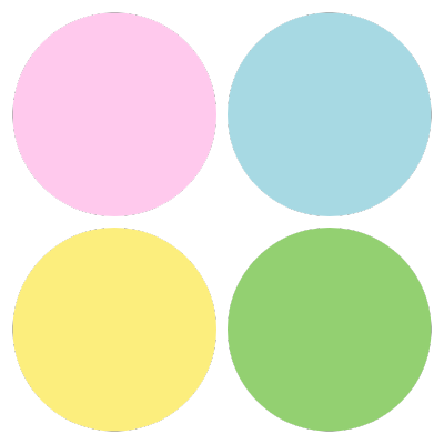
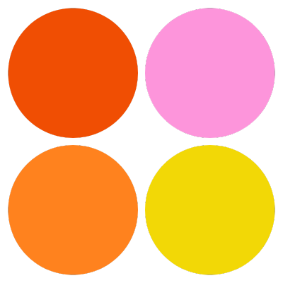
Next up, we needed to decide on a general color palette. Alex had expressed she wanted it to be very colorful & for it to stand out, so I narrowed the whole rainbow down to a couple of palettes of similar essence, but slightly different tones. First, a “nold” palette, second a “pastel” palette, & finally, our “sunset” palette.
Like I mentioned before, Alex had a clear vision for this project, Straightaway, she knew we needed to move forward with none other than the “bold” palette (pictured first).

3. Incorporating All the Elements
Alex had a bold vision and a long list of symbolic elements to include:
- Three stars, as seen on the Washington D.C. flag.
- A rainbow, to symbolize inclusion and hope.
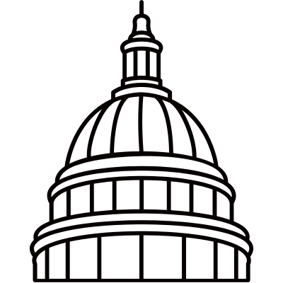
- The Washington D.C. Capitol Building, an iconic symbol of the city.
- Roller skates to highlight what the club was all about.
- And finally, a butterfly because she like them.




4. Finding Visual Balance
If we’re going to include all the symbolic elements Alex had requested, we were going to have to be smart about how we laid this all out. There’s a lot of ways we could’ve gone with this, (pictured below) but after deliberating over these three variations, only one choice made itself clear.
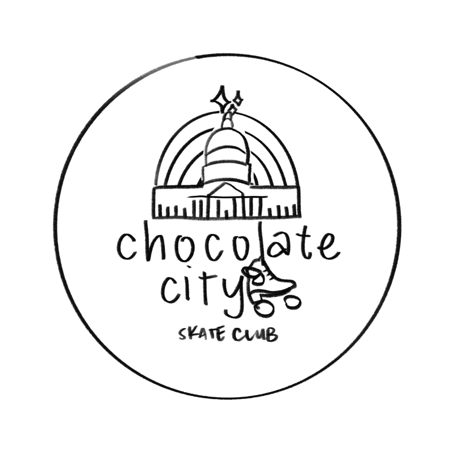
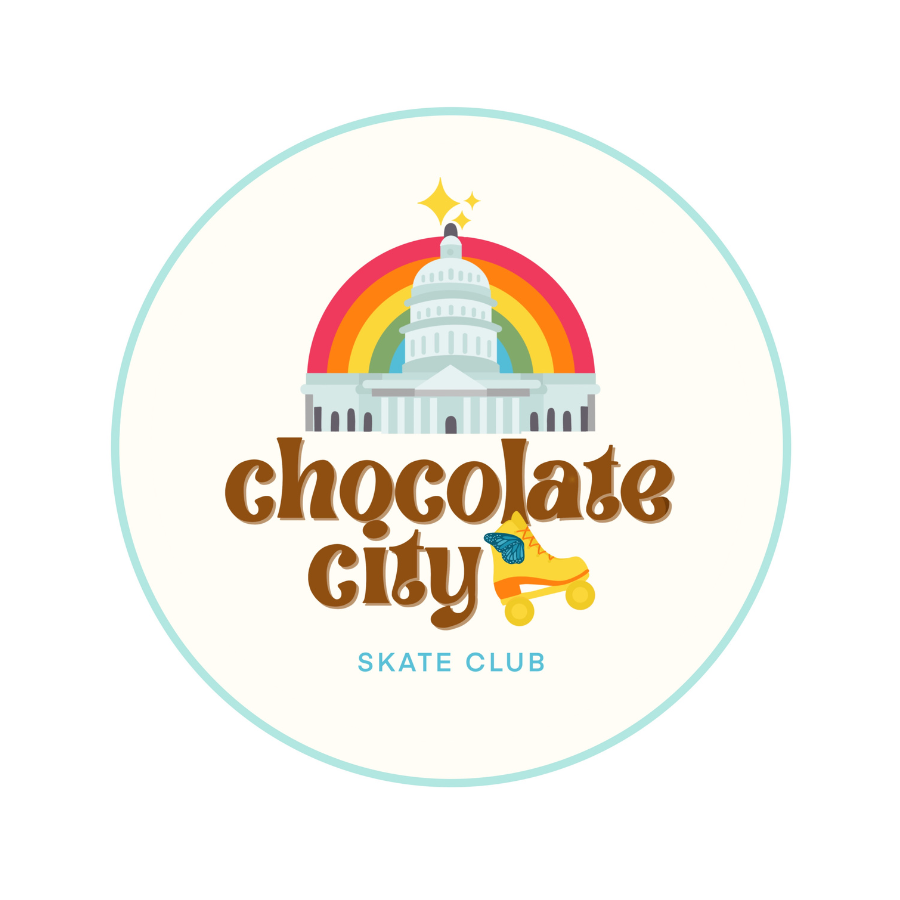
We went with the middle option, dawning stacked text, a roller skate, and variant text. We felt it would fit best in a circle and created the msot visual interest without creating too much chaos.


5. Finalizing the Design
Now we just had to put this all together: the fonts, the colors, the artwork.
It’s not often you strike gold the first time, but I’d be lying if I said we changed anything after this first draft. Alex and I both fell in love with the logo after the very first draft and it only got better when we vectorized it in color.
It was everything we’d aimed for: retro, legible, colorful, joyful, playful, deeply symbolic. It spoke for itself.
Key Takeaways
Today, the Chocolate City Skate logo stands as a widespread symbol of connection and expression. Members proudly wear and share the the logo on t-shirts, stickers stuck on water bottles, laptops, and lampposts.
I feel so passionately about this project. It was one of the first logos I created and now, even years later, it feels classic and so perfect for the organization it represents.
I learned a lot about collaboration. It’s through Alex’s vision and willingness to work with me constructively that we ended with such a strong product that so far stands the test of time.