Case Study: Chocolate City Skate
Where Movement Meets Meaning
Project Overview

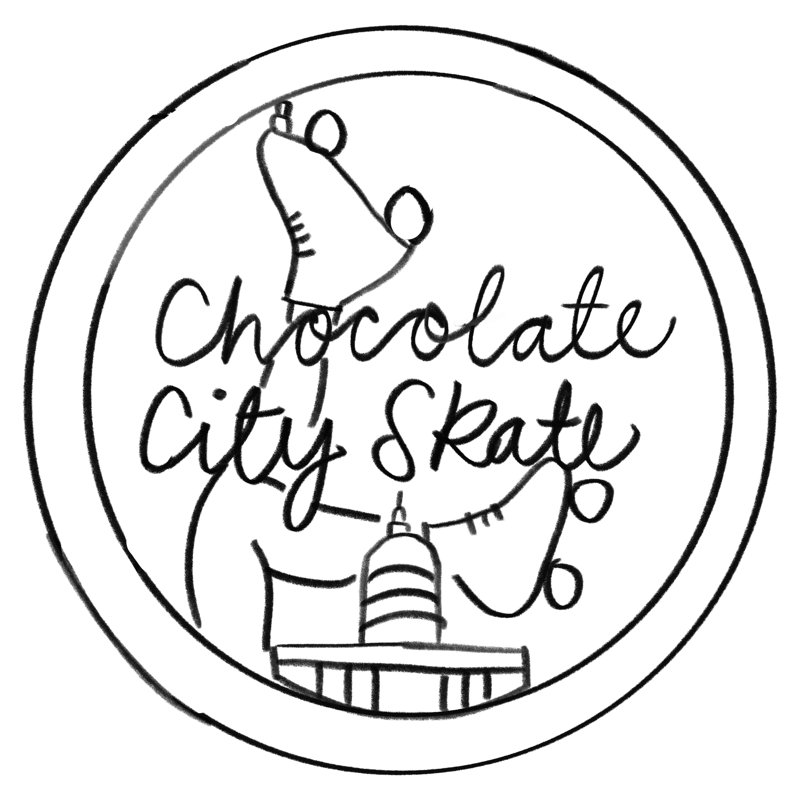
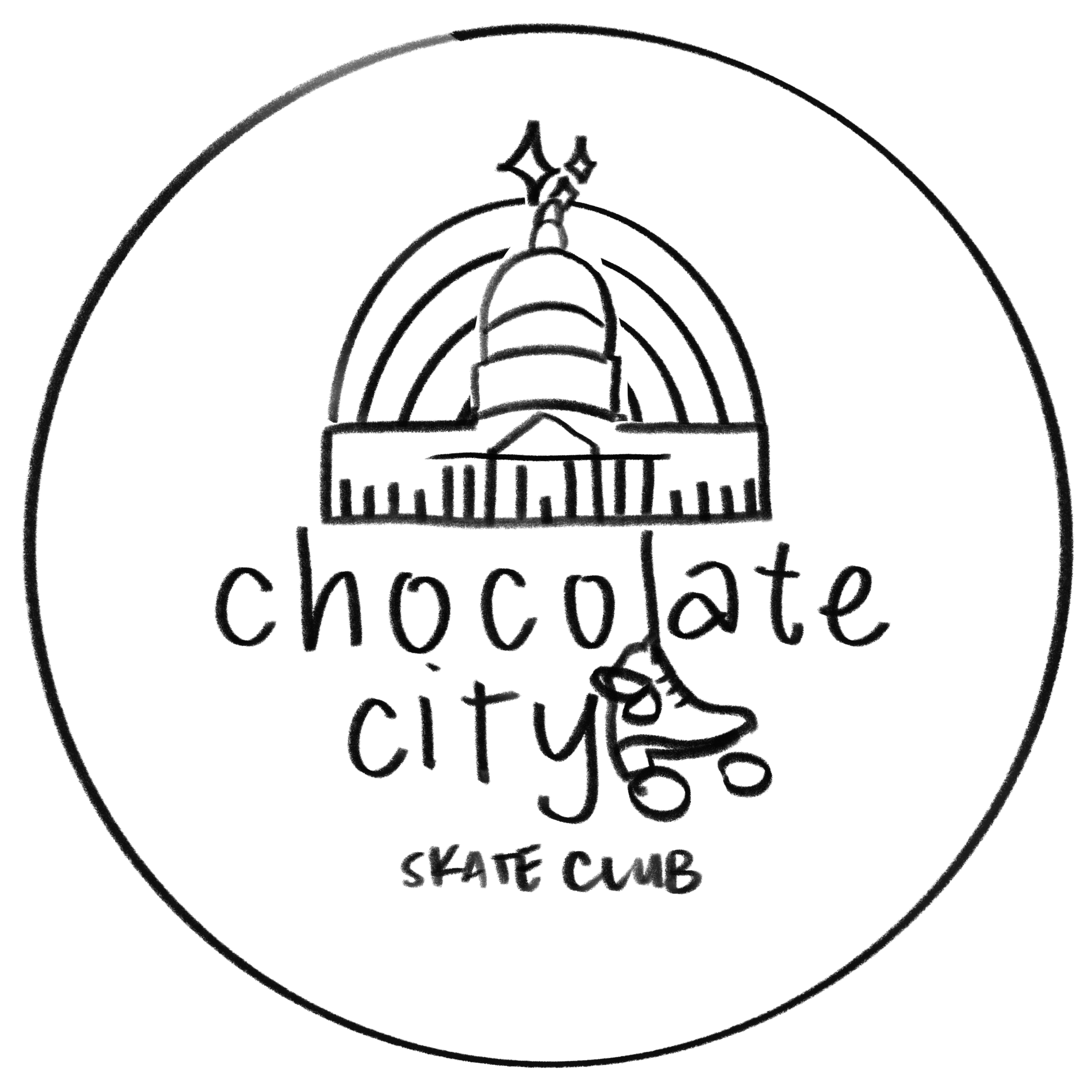
Sketching & Iteration
The early phase involved dozens of rough sketches, layout explorations, and note-heavy meeting sessions. I tested different visual hierarchies, character placement, and combinations of symbolic components.
Alex had a bold vision and a long list of symbolic elements to include:
- The Capitol building
- A skater silhouette
- Stars
- Rainbows
- Retro typography
- Roller skates
- A subtitle
- A style that feels joyful, retro, and cultural
The difficulty: incorporate all of these elements without sacrificing clarity, cohesion, or readability, and design two versions that stay consistent without feeling identical.
“I want everything—just cleaned up.” — Alex
The Creative Process

I explored multiple:
- Color palettes
- Typography directions
- Illustrated assets
- Layout compositions
The process was intentionally messy—embracing experimentation, layering, and refinement until the right balance emerged. Each iteration brought us closer to logos that felt like movement, not just images.
The Solution
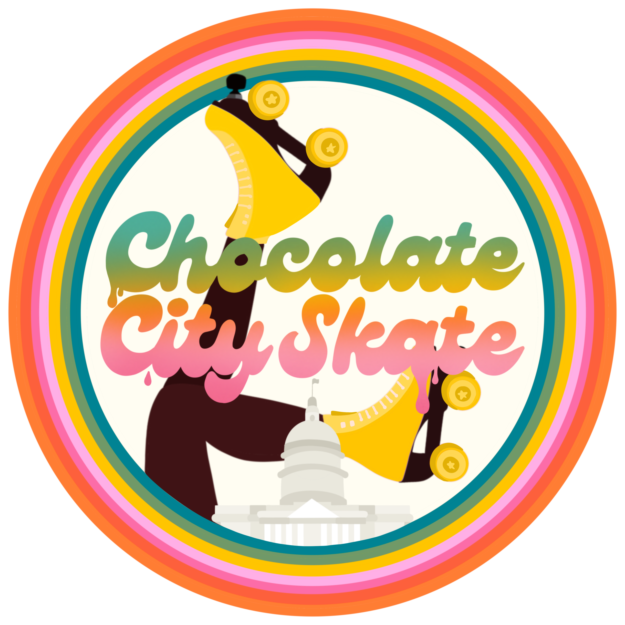
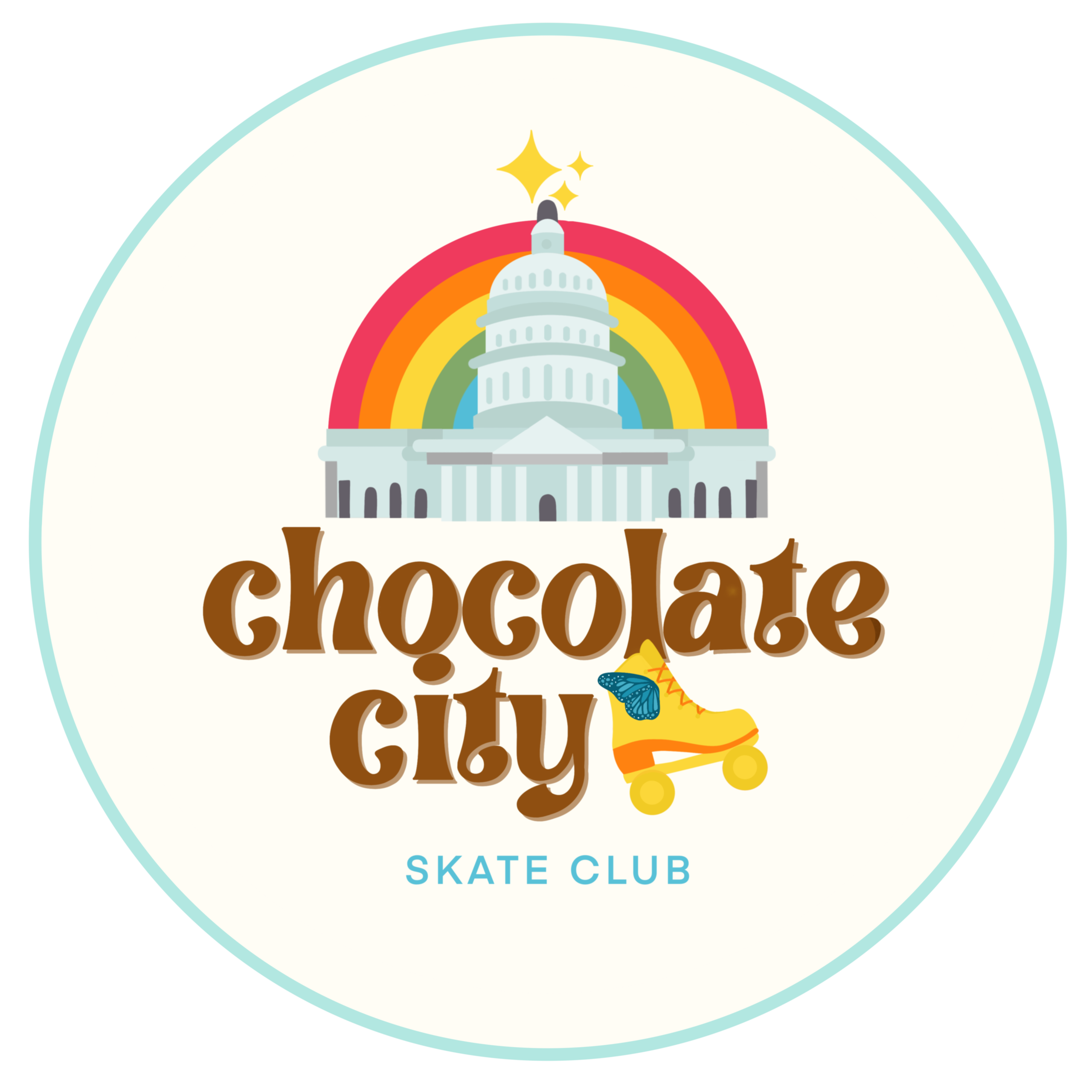
We finalized two polished logo systems with:
- Unified shapes and structure
- Distinct silhouettes and emphasis for each use case
- Strong visual identity across digital and print
- Variations optimized for merch, profile icons, and large-format signage
The Capitol anchors cultural identity, the skater silhouette brings motion, stars and circular framing unify the layout, and the rainbow arc symbolizes community and joy.
Bringing it to Life
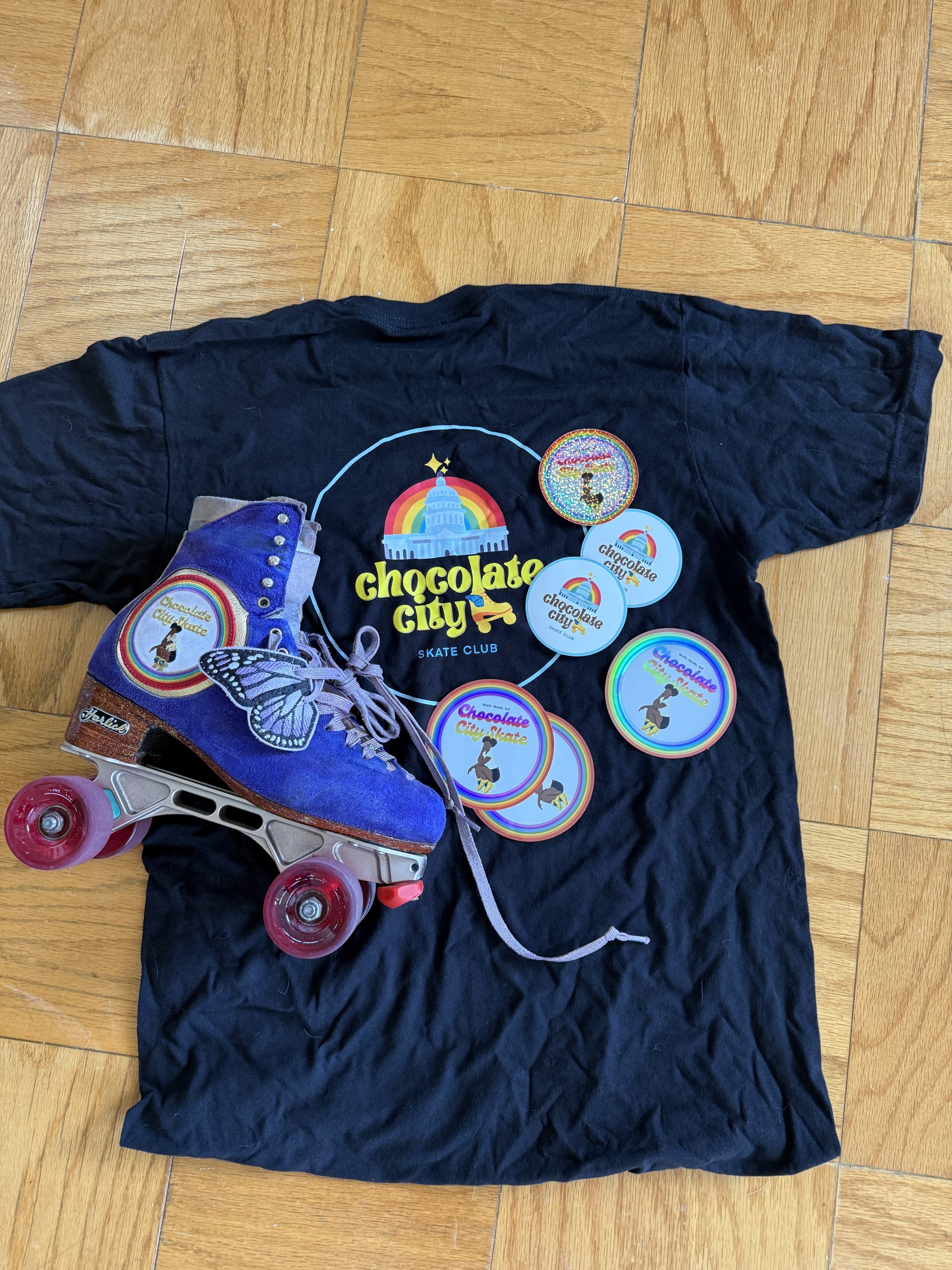
Once finalized, the logos launched across:
- Social media branding & profile icons
- Stickers, patches, and printed t-shirts
- Custom roller-skate plates
- Event merchandise and signage
The community response was instant — members proudly wore and shared the symbol created for them.
The Result
Today, Chocolate City Skate stands as a widespread symbol of connection and expression:
- Hundreds of active members
- Thousands of engaged followers
- Merchandise worn around the world
- A recognizable identity tied to culture, joy & movement
The logo has grown beyond design into a badge of belonging.
